Every Artisan Anthology planner starts with a story — not just lines and boxes, but emotions, habits, dreams, and goals.
Creating digital planners that feel alive takes more than software skills — it’s about understanding human intention, visual harmony, and the magic of meaningful design.
If you’ve ever wondered how I create my signature Artisan Anthology Planners — this behind-the-scenes post reveals everything from concept to final touch.
🌸 The Philosophy Behind Artisan Anthology Planners
At Artisan Anthology, I don’t just design planners.
I design experiences of self-organization, self-expression, and self-growth.
Each digital planner is:
- Rooted in psychology — to help you feel calm, clear, and confident.
- Balanced in aesthetics — minimalist layouts, soft colors, and clean typography.
- Built for real productivity — whether you’re planning your day, business, or dreams.
💬 I believe that a planner should feel like a sanctuary — not a system.
🪄 Step-by-Step: How I Create My Signature Digital Planners
Creating a planner for Artisan Anthology is an intentional art form. Here’s how every product comes to life:
1. Inspiration & Research: Understanding What You Need Most
Every design starts with research — but not just trends. I look into:
- User psychology: What motivates you to plan?
- Pain points: Where do most people lose focus or give up?
- Lifestyle goals: Are you planning for productivity, wellness, or creativity?
I analyze:
- Pinterest trends
- Planner communities’ discussions
💬 This helps me create designs that are visually soothing yet functionally powerful.
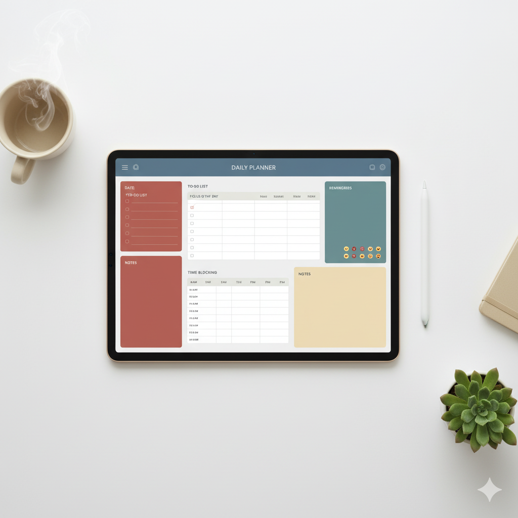
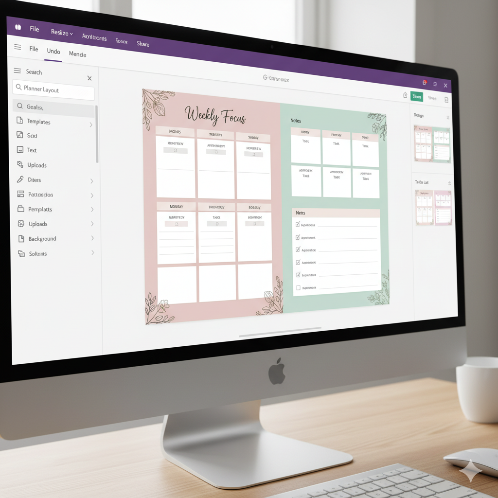
2. Sketching the Planner Blueprint
Before Canva or Procreate ever opens, I sketch layouts on paper:
- Goal-setting sections
- Daily/weekly views
- Mindset prompts
- Reflection pages
Each section must flow with intuitive logic — not just aesthetics.
Think: Less clutter, more clarity.
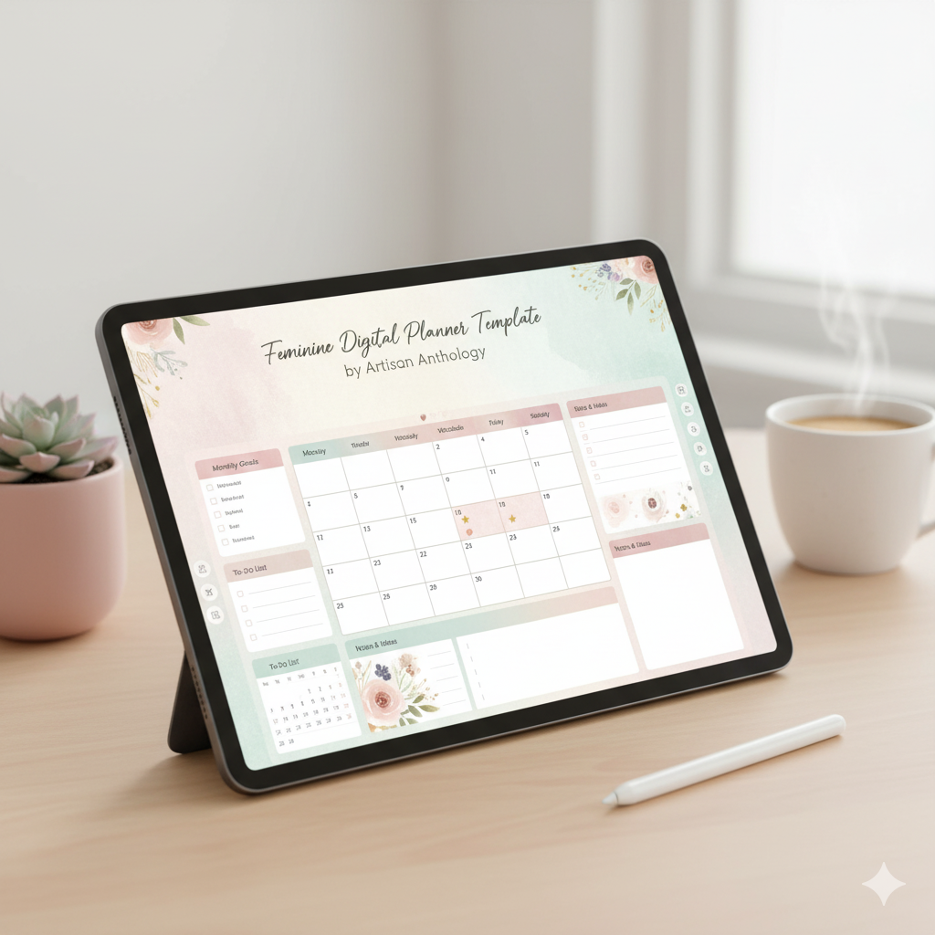
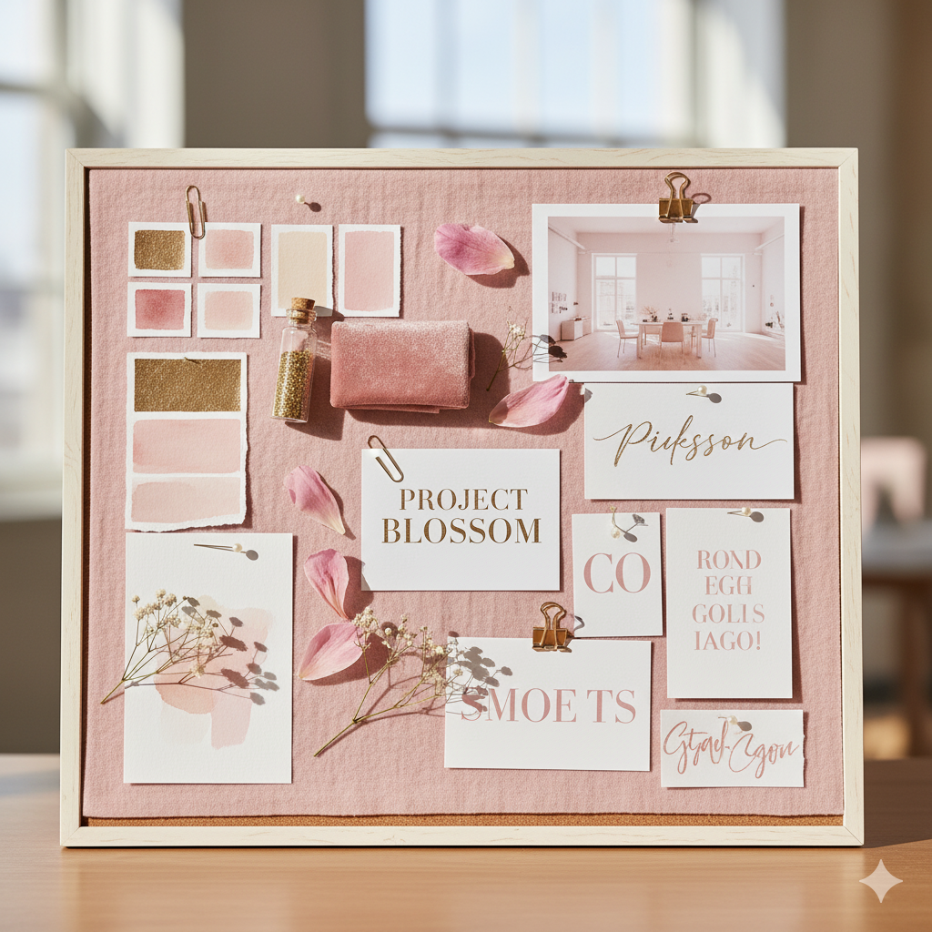
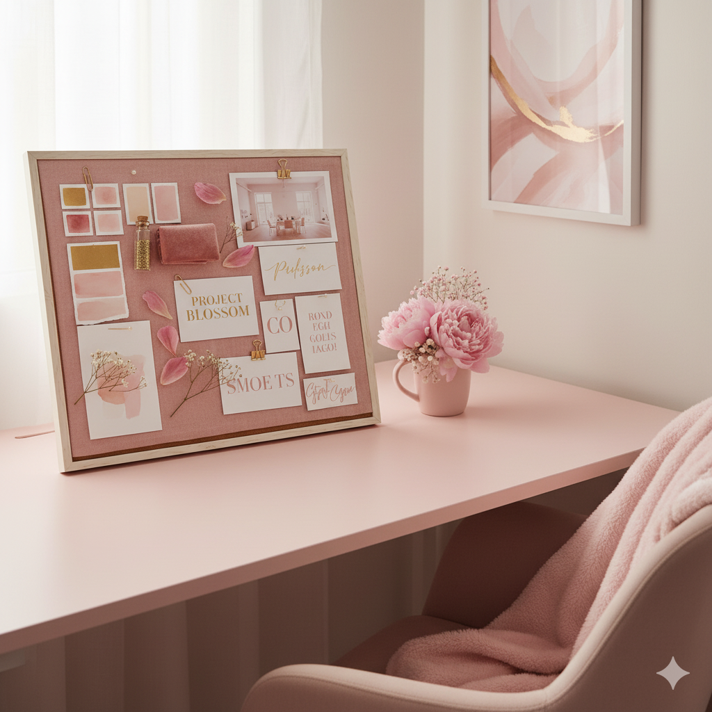
3. Color Psychology & Mood Boards
Colors evoke emotions — and I use that psychology in every design.
| Mood | Color Palette | Best For |
|---|---|---|
| Calm Focus | Beige, soft grey, ivory | Minimalist planners |
| Empowerment | Blush pink, gold, white | “That Girl” planners |
| Creativity | Lavender, sage, peach | Vision boards & journals |
| Business Clarity | Navy, cream, nude | Entrepreneur planners |
I design every palette in Canva Pro with complementary shades that translate well on iPad screens.
💬 The goal? To make your planner feel peaceful, not pressured.
4. Typography: The Voice of Design
Fonts define personality. I combine:
- Serif fonts for sophistication
- Sans-serif fonts for clarity
- Script fonts for emotion
💡 Example: “Playfair Display” (titles) + “Montserrat” (body) = clean, premium vibe.
All Artisan Anthology planners use typography that’s readable, modern, and elegant — optimized for both digital and printable formats.
5. Building in Canva (or Procreate for Illustrations)
I design the full planner inside Canva, ensuring every element is:
- Aligned perfectly
- Linked interactively (hyperlinks for tabs, sections, and dashboards)
- Scalable across iPad, desktop, or phone
For illustrated planners, I use Procreate for:
- Hand-drawn icons
- Doodles
- Watercolor effects
💬 Every icon, brush stroke, and divider is custom — no cookie-cutter templates.
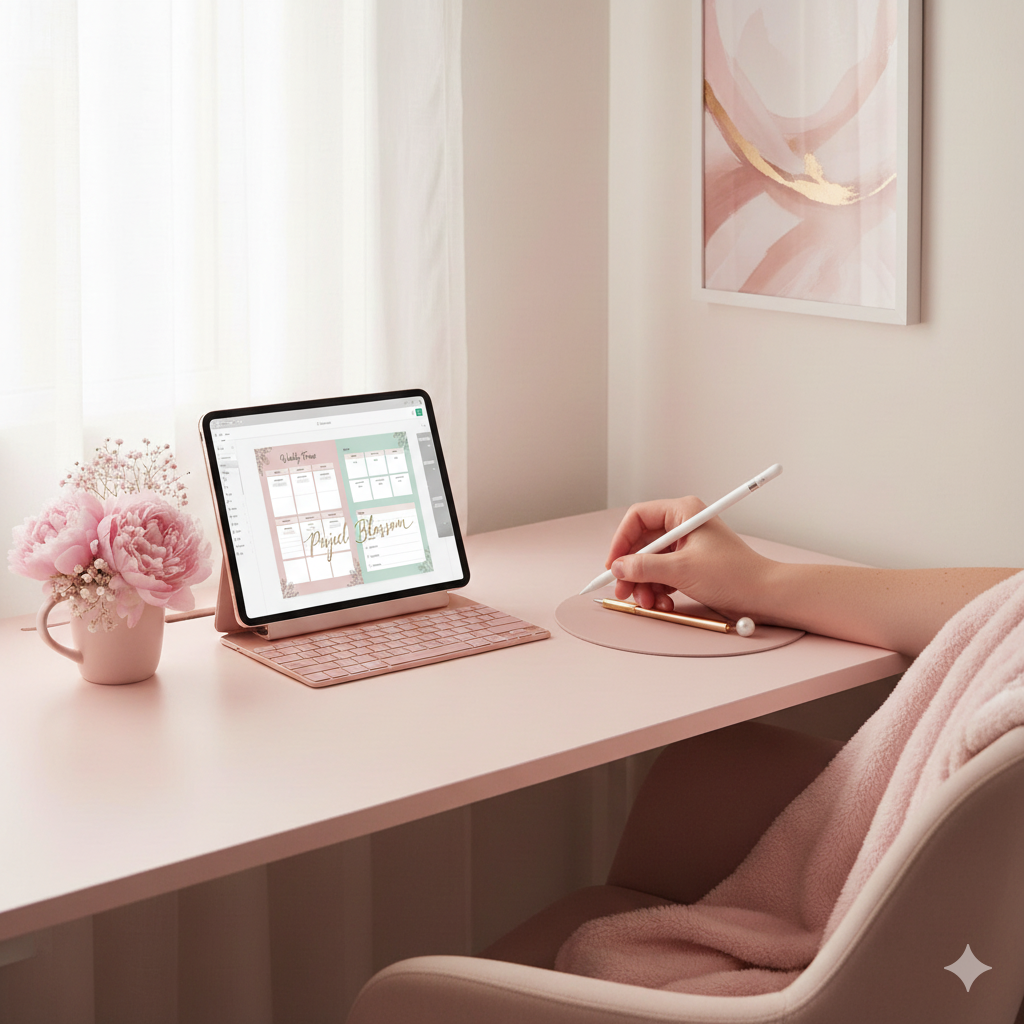
6. Adding Interactive Tabs & Hyperlinks
A digital planner should feel alive.
That’s why I add:
- Clickable tabs
- Linked index pages
- Navigation dashboards
This makes your planning experience fluid and intuitive — no scrolling endlessly to find a section.
💬 Usability meets aesthetics — every tap feels effortless.
7. Testing & Refining the Planner
Before launching on Etsy or Payhip, I test the planner:
- On GoodNotes, Notability, and Noteshelf
- Across iPad Pro, Air, and mini
- For color consistency, hyperlink accuracy, and zoom readability
Only when the experience feels flawless do I finalize it.
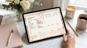
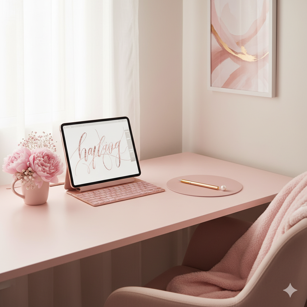
8. Creating Mockups That Tell a Story
The planner visuals matter just as much as the design itself.
I craft high-end mockups using:
- Canva Smart Mockups
- Styled iPad scenes
- On-brand color props (coffee, flowers, gold accents)
Each image mirrors the Artisan Anthology aesthetic — timeless, feminine, and minimal.
💫 Comparison Table: My Digital Planner Design Workflow
| Design Phase | Tool Used | Focus Area | Outcome |
|---|---|---|---|
| Research & Moodboarding | Pinterest, Canva | Audience insight | Emotional connection |
| Layout Design | Canva | Structure & usability | Balanced sections |
| Illustration | Procreate | Artistic touch | Visual charm |
| Interactivity | Canva Hyperlinks | Clickable navigation | Smooth flow |
| Testing | GoodNotes, Notability | Functionality check | Seamless use |
| Mockup Creation | Canva Smart Mockups | Visual branding | Scroll-stopping listing |
🌿 My Design Signature: The “Artisan Touch”
Every Artisan Anthology planner follows 3 secret design principles:
- Visual Calmness: Minimal elements, white space, and soft colors to reduce cognitive overload.
- Emotional Connection: Pages that speak to your goals, not just manage tasks.
- Feminine Empowerment: Elegant typography, delicate balance, and layouts that inspire focus and flow.
💬 I believe productivity feels better when it looks beautiful.

💬 FAQs
❓ What makes Artisan Anthology planners unique?
Each planner combines elegant design, intuitive structure, and emotional wellness principles — crafted to help you feel organized and inspired daily.
❓ Which app works best with Artisan Anthology planners?
My planners are fully compatible with GoodNotes, Notability, and Noteshelf, offering clickable tabs and smooth navigation.
❓ Can I edit the colors or fonts in the planner?
Yes! If you purchase an editable Canva version, you can easily adjust fonts, tones, and layouts to match your personal style.
❓ How long does it take to design one planner?
Each Artisan Anthology planner takes around 40–60 hours — from concept and sketch to final mockups and testing.
❓ Where can I buy Artisan Anthology planners?
You can explore all planners and templates on my Official Website,featuring instant digital downloads.
💫 Practical Tips for Beginner Digital Planner Creators
- Start with a theme — don’t design blindly; define your emotional goal.
- Limit your fonts — 2–3 fonts max for clean readability.
- Test before publishing — always ensure hyperlinks work seamlessly.
- Keep mockups consistent — same tone, brightness, and composition.
- Focus on usability first — beauty follows clarity.
💬 Remember: design simplicity is the new luxury.
🌷 Conclusion: The Art of Planning Beautifully
Creating a digital planner isn’t just about rectangles and fonts — it’s about creating peace of mind.
Every Artisan Anthology planner is designed to simplify your chaos, organize your goals, and reflect your personality.
💖 When you open an Artisan Anthology planner, I want you to feel inspired — like your life finally fits perfectly on the page.
✨ Ready to experience that feeling?
Explore my collection of Signature Artisan Anthology Planners — handcrafted to turn your everyday routines into rituals of beauty and clarity.
✨ About Artisan Anthology
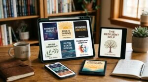
At Artisan Anthology, we curate timeless digital creations designed to inspire and elevate every part of your lifestyle. Our collection includes brand books, digital templates, recipes, ebooks, wardrobe planners, fashion guides, printable wall art, and elegant home décor designs. We also specialize in wedding cards, invitations, baby shower cards, and engagement cards, each crafted to celebrate life’s most meaningful moments.
For professionals and dreamers alike, our CV templates, guided journals, and manifestation planners are created with intention to help you tell your story beautifully and authentically.
✨ Discover our full collection of digital planners here → artisananthology.xyz