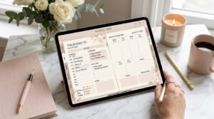
Aesthetic digital planners are everywhere—soft neutrals, pastel icons, handwritten fonts, perfectly styled layouts. But if you’ve ever created a gorgeous planner setup and then stopped using it after a week, you’ve discovered the hidden problem:
Aesthetic without function doesn’t last.
The goal of digital planning isn’t to create art—it’s to support your life, your productivity, and your mental clarity while still looking good. In this guide, you’ll learn exactly how to keep your digital planner aesthetic and functional, using proven strategies that balance beauty, usability, and consistency.
Whether you’re a beginner or an experienced digital planner user, this article will help you design a planner you’ll actually come back to.
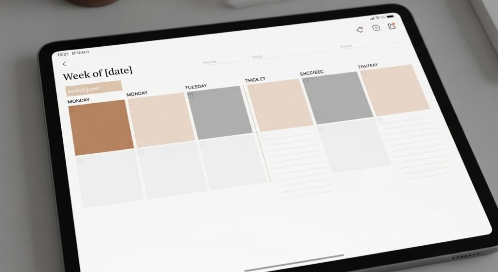
What Does “Aesthetic but Functional” Really Mean?
An aesthetic but functional digital planner:
- Looks visually calming and intentional
- Is quick and easy to use daily
- Reduces decision fatigue
- Supports real-life productivity
It’s not about perfection. It’s about design serving function, not the other way around.
Why Aesthetic-Only Digital Planners Fail
Many planners look amazing on Pinterest—but fall apart in real life.
Common Aesthetic Planner Mistakes
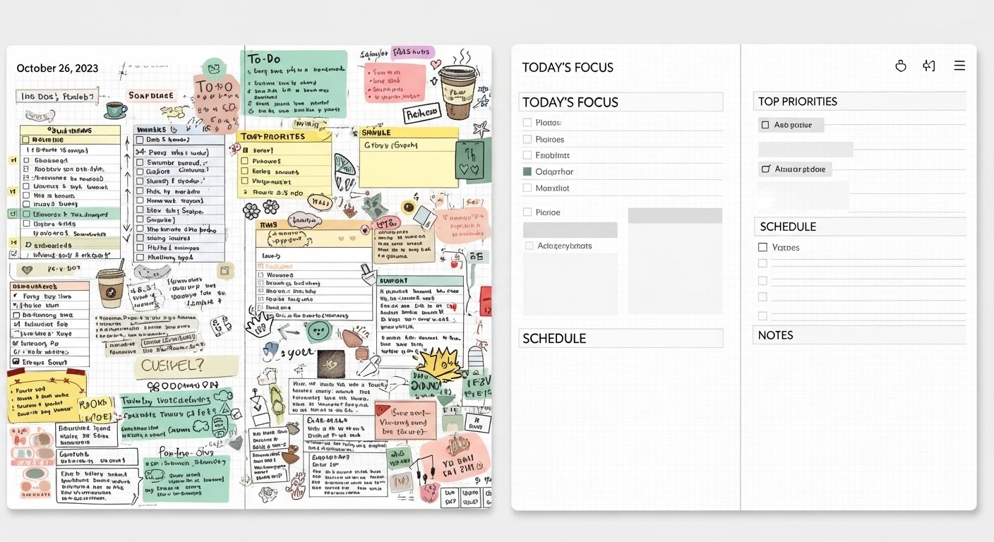
- Too many fonts and colors
- Overloaded decorative stickers
- Complicated layouts
- Too many daily sections
- Excessive page flipping
If your planner feels like a design project every time you open it, it won’t last.
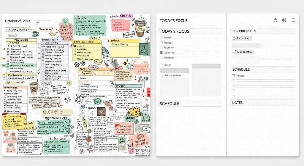
Aesthetic vs Functional Digital Planner (Comparison Table)
| Feature | Aesthetic-Only Planner | Aesthetic + Functional Planner |
|---|---|---|
| Fonts | Multiple decorative fonts | 1–2 readable fonts |
| Color Palette | Trend-based, busy | Soft, consistent palette |
| Stickers | Decorative overload | Purpose-driven stickers |
| Layout | Complex sections | Clear visual hierarchy |
| Daily Use | Time-consuming | Fast & intuitive |
| Longevity | Short-term | Long-term consistency |
👉 Key insight: Function should always come before decoration.
Step 1: Choose a Minimal Color Palette
Color is the foundation of planner aesthetics.
Best Color Rules for Functional Planning
- 2–3 main colors
- 1 accent color
- Neutrals for structure
Soft neutrals (beige, taupe, soft gray, sage) reduce visual noise and make planning easier on your eyes.
Step 2: Limit Fonts for Maximum Readability
Fonts dramatically affect usability.
Recommended Font Structure
- One handwritten-style font for headings
- One clean sans-serif font for writing
Avoid overly decorative fonts for daily tasks—they slow you down and increase eye strain.
Step 3: Use Stickers With a Purpose
Stickers should support planning, not distract from it.
Functional Sticker Ideas
- Priority labels
- Appointment icons
- Checklists
- Section dividers
💡 If a sticker doesn’t save time or add clarity, it doesn’t belong.
Step 4: Design Layouts Around Your Real Life
Your planner should reflect how you actually live—not an idealized version.
Ask Yourself:
- Do I prefer lists or time blocks?
- Do I need daily or weekly planning?
- How much writing space do I use?
Aesthetic layouts fail when they don’t match real habits.
Step 5: Embrace White Space
White space is not wasted space—it’s visual breathing room.
Benefits of White Space
- Improves focus
- Reduces overwhelm
- Makes pages look elegant
- Allows flexibility
Minimalism is functional luxury.
Step 6: Create Reusable Aesthetic Pages
Reusable pages keep your planner beautiful and efficient.
Best Pages to Reuse
- Daily task lists
- Weekly overviews
- Habit trackers
- Brain dump pages
Duplicating familiar layouts keeps planning fast and stress-free.
Step 7: Use Digital Tools to Maintain Clean Aesthetics
Digital planning offers tools paper never could.
Digital Features That Preserve Aesthetics
- Undo instead of erasing
- Layers for stickers
- Copy/paste repeated elements
- Zoom for precise writing
These tools help maintain clean pages without perfectionism.
Step 8: Keep Decoration as a Reward, Not a Requirement
Decoration should enhance planning—not block it.
Healthy Planner Mindset
❌ “I can’t plan until it looks perfect”
✅ “I can decorate after I plan”
Function first. Beauty second. Always.
Best Aesthetic Styles That Stay Functional
Some styles naturally balance beauty and usability.
Popular Functional Aesthetic Styles
- Minimal neutral
- Soft pastel
- Scandinavian-inspired
- Modern luxury
- Clean typography
These styles age well and reduce burnout.
FAQs
How do I keep my digital planner aesthetic without losing productivity?
Use minimal colors, limit fonts, and decorate after planning—not before.
Are aesthetic digital planners bad for productivity?
Not if they’re designed with clear layouts, white space, and functional elements.
How many colors should a digital planner have?
Ideally no more than 3–4 colors, including neutrals.
What makes a digital planner functional?
Clear layouts, readable fonts, reusable pages, and fast daily usability.
Can beginners use aesthetic digital planners?
Yes—minimal aesthetic planners are ideal for beginners when kept simple.
Final Thoughts: Beauty Should Support Your Life
A digital planner doesn’t need to be perfect to be beautiful.
When your planner:
- Feels calming
- Is easy to use
- Reflects your real habits
…it becomes both aesthetic and functional—without burnout.
Your Next Step
Simplify one thing today:
- Reduce colors
- Remove unused pages
- Switch to one font
Small changes create long-term consistency.
✨ About Artisan Anthology
At Artisan Anthology, we curate timeless digital creations designed to inspire and elevate every part of your lifestyle. Our collection includes brand books, digital templates, recipes, ebooks, wardrobe planners, fashion guides, printable wall art, and elegant home décor designs. We also specialize in wedding cards, invitations, baby shower cards, and engagement cards, each crafted to celebrate life’s most meaningful moments.
For professionals and dreamers alike, our CV templates, guided journals, and manifestation planners are created with intention to help you tell your story beautifully and authentically.
✨ Discover our full collection of digital planners here → ArtisanAnthology.xyz